
Lab 3.x: CSS Layout
⚠️ Unmarked Lab
🎯 Lab ObjectiveIn this lab, you will page layout in CSS.
This lab teaches the following concepts:
- FlexBox layout
- Grid layout
- responsive design
Table of Contents
The basic selectors:
| Selector | Example | Description |
|---|---|---|
| universal | * | selects all elements |
| type | h1 | select all <h1> elements |
| class | .name | selects all elements with class="name" |
| id | #name | selects all elements with id="name" |
| Selector | Example | Description |
|---|---|---|
| Grouping | div, h1 | selects all <h1> elements and <div> elements |
| Descendant | div h1 | selects all <h1> inside <div> elements |
| Direct Descendant | div > h1 | selects all <h1> where the parent is a <div> |
| Adjacent Sibling | div + h1 | selects the first <h1> that is immediately after a <div> |
| General Sibling | div ~ h1 | selects every <h1> that is after a <div> |
| Chaining | .class1.class2 | selects all elements with both class1 and class2 as class attributes |
| Attribute | div[lang] | selcts all <div> elements which have a lang attribute |
| Selector | Example | Description |
|---|---|---|
| Hover | div:hover | selects a <div> when mouse enters its bounds |
| Not | :not(div) | selects all elements which are not <div> elements |
| Root | :root | selects the root element of the page (usually <html>) |
| Only child | div p:only-child | selects every <p> if it is also the only child of a <div> |
| First child | div p:first-child | selects every <p> if it is also the first child of a <div> |
| First occurence | div p:first-of-type | selects the first occurence of <p> within each <div> |
| Last child | div p:last-child | selects every <p> if it is also the last child of <div> |
| Last occurence | div p:last-of-type | selects the last occurence of <p> within each <div> |
| nth child | div p:nth-child(2) | selects every <p> which is the second child of each <div> |
| nth occurence | div p:nth-last-child(2) | selects every <p> which is the second to last child of each <div> |
| nth Type | div p:nth-of-type(odd) | selects every odd indexed <p> inside a <div> |
The most important aspect of CSS is layout. We need presentable websites for a variety of screen sizes; from smart phones to 4K smart TVs. Using CSS to create your layout can seem simple but if you don’t understand the fundamental concepts it can lead to frustration…
In the previous lab we covered most fundamentals.
- Document Flow
display: block;<div>block
display: inline;<span>inline
- Box Model
widththe elements widthheightthe elements heightmargintransparent space between elements.paddingtransparent space around content.bordervisual space around the padding and content.
- Positioning
position: static;cannot move from the normal flow.position: relative;can move; relative to normal flow position.position: fixed;can move; relative to viewport (ignores scrolling).position: absolutecan move; relative to a positioned ancestor element.- Properties which move a positioned element:
top,right,bottom,left
The layout fundamentals we have covered so far are sufficient to create any website layout. However, some of the concepts are unintuitive and can lead to idiomatic code.
✅ TipIn software development an idiom is a reusable code snippet that is commonly used to achieve some task. Idioms are always obvious to newcomers, they can feel cryptic or even hacky.
Idioms are usually shared by experts to newcomers on websites like https://stackoverflow.com/
This idiom uses margin: auto to centre elements. The margin is calculated by the browser to be equal on all sides. This idiom only works on block elements.
The below popular idiom shows how to arbitrarliy position a block element (within a parent container) using position: absolute
Another idiom all CSS developers know (similar to the previous) is how to centre a block element vertically and horizontally:
With enough reading and practice you can understand exactly how these idioms work, but we all agree many are not intuitive for a newcomer and some feel a bit hacky.
Surely there’s an easier way?
The easier way is Flexbox and/or CSS Grid. Both were designed to be easy to use and less reliant on hacky idioms. FlexBox became fully supported by all major web browsers around 2015 and CSSGrids around 2017.
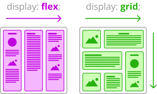
The main point of difference between these 2 is that Flexbox is designed to arrange items in a single direction (row or column) whereas CSS Grid is designed to arrange items in both directions.
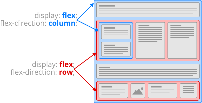
Introducing Flexbox. Any element with display: flex; will auto-magically arrange their child elements into a row (or column). We’ll only cover the basics but you may research the advanced properties on your own.
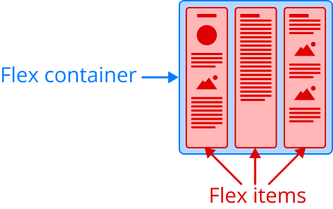
To use Flexbox you need a container element with display: flex;. Usually we use a <div> for the flex container, but any element would work. A flex item is any element which is a direct descendant (child) of the flex container.
The gap property assigns space between flex items.
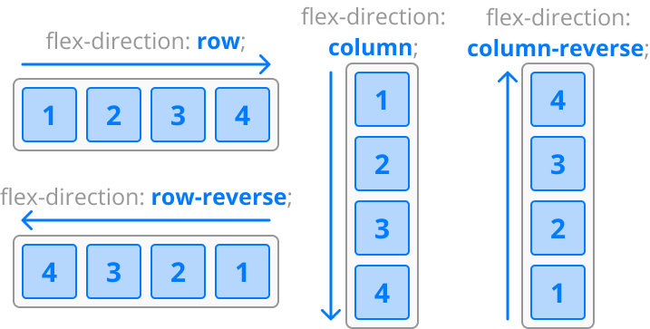
The flex-direction property defines the direction the children will be arranged. The default value is row, but there is also: row-reverse, column, and column-reverse.
You can nest flex containers by making any of the flex items a flex container (i.e display: flex). You can mix and match rows and columns to compose almost any layout with ease.
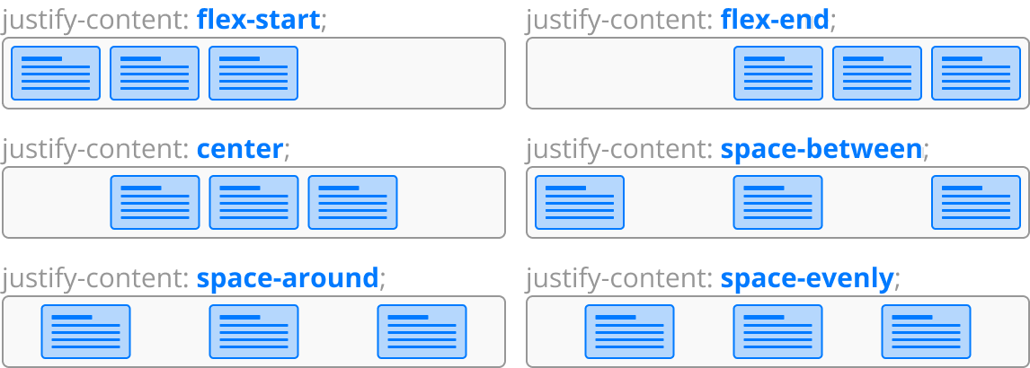
The justify-content property defines how flex items are spaced out, relative to the flex container’s direction. The default value is flex-start but there are several others.
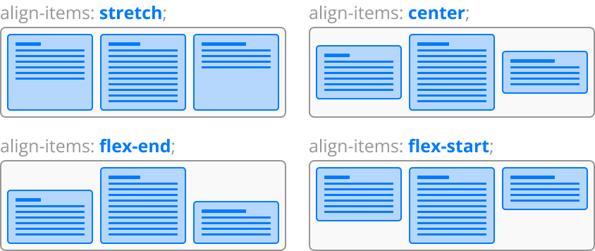
The align-items property defines how flex items are aligned. Vertically aligned in a row, horizontally aligned in a column.
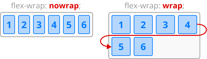
By default all the flex items will attempt to squeeze into a single line, but you can use flex-wrap to allow the items to flow into another row (or column).
Below is an example where you may inspect the HTML and CSS.
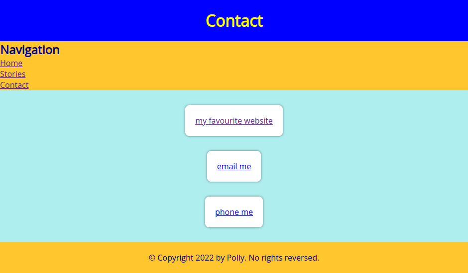
📝 Task 1: Implement Flexbox
- Use Flexbox on the contact page
- open the previous lab files (Polly’s website)
- modify
style.cssto provide a better layout forcontact.html- start by setting
display: flex;on<main>- below is an ugly example, I’m sure yours will be much prettier
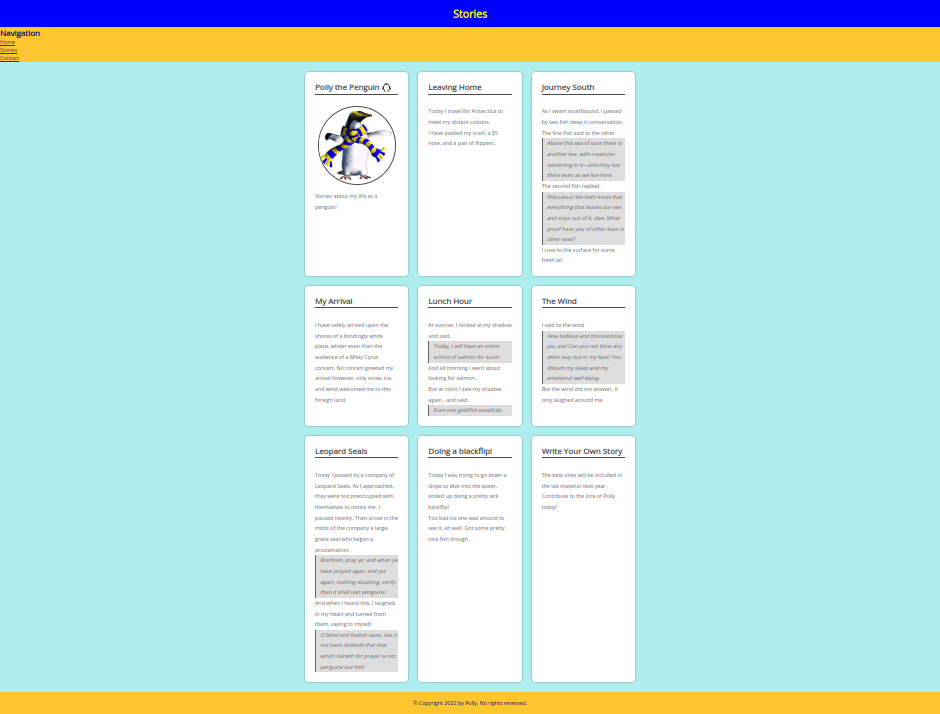
- Use Flexbox on the stories page
- here is more content for stories.html
- modify
style.cssto provide a better layout forstories.html- include
flex-wrapin your design- below is an example (yours will be prettier)
✅ TipA more complete guide to Flexbox on css-tricks.com
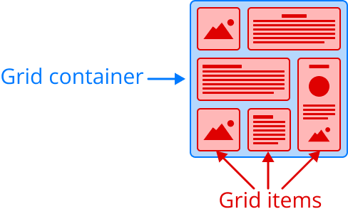
Grid layout shares many properties with Flexbox. Firstly, to use the Grid layout you need a container element with display: grid;. A grid item is any element which is a direct descendant (child) of the grid container.
The grid items won’t immediately arrange themselves until you have declared how many rows/columns and the size of each row/column.
To declare both the number or rows and their respective widths use the grid-template-rows property on the grid container. There is also grid-template-columns for declaring the columns.
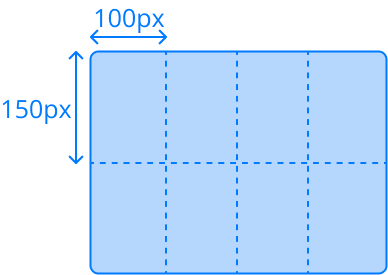
For example, below is a grid with 2 rows and 4 columns. Each row is 150px tall, and each column is 100px wide.
.grid-container {
    display : grid;
    grid-template-rows: 150px 150px; /* 2 rows, 150px tall */
    grid-template-columns: 100px 100px 100px 100px; /* 4 columns, 100px wide */
}
✅ TipDelcaring rows and columns can be simplified with
repeat().grid-container { display : grid; grid-template-rows: repeat(2, 150px); grid-template-columns: repeat(4, 100px); }
Much like Flexbox we can declare the space between grid items with the gap property. Or we can declare different gap sizes for rows and columns using column-gap and row-gap.
.grid-container {
    gap: 16px;
    row-gap: 8px;
    column-gap: 16px;
}
If you want rows/columns to reisze to fit the browser window you might be tempted to use % units, something like: grid-template-rows: 50% 50%, but unfortunately this method doesn’t consider the gaps between rows/columns. Instead, you should use the fr unit, the fractional unit.
In the below example there are 3 columns, the middle column is 2fr so will be twice the width of the columns that are 1fr.
.grid-container {
    display : grid;
    grid-template-rows: 1fr 2fr 1fr;
    grid-template-columns: repeat(2s, 1fr);
}
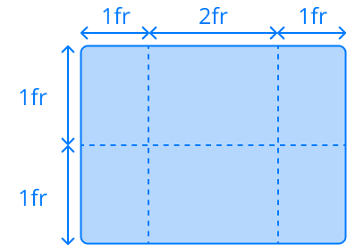
✅ TipYou can mix units in the same declaration.
div {
    display: grid;
    grid-template-columns: 200px 3fr 1fr;
}
The above example declares 3 columns. The first column will occupy 200 pixels of the grid, and the remaining width of the grid will be distributed between the other 2 fractional columns, such that
3fris triple the width of1fr.
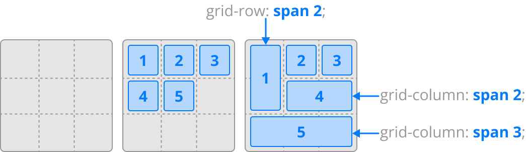
Grid items will arrange themselves to fit within the next available Grid cell, from top left to bottom right. A grid item can span any number of rows and columns using the grid-row and grid-columns properties.
.grid-item-1 {
    grid-row: span 2;
}
.grid-item-2 {
    grid-column: span 3;
}
.grid-item-3 {
    grid-row: span 2;
    grid-column: span 3;
}
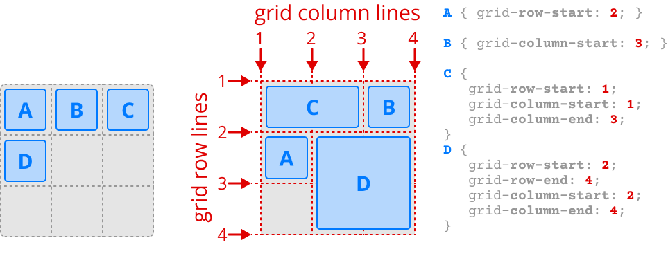
Grid items will place themselves in order. You can override this order and place a grid item in any arbitrary row/column with grid-row-start and grid-column-start.
There are also grid-row-end and grid-column-end which will span the grid item to any arbitrary row/column. All of these properties expect grid lines as values, where grid lines are the lines between row/columns.
In the below example the there are 3 rows, 3 columns, 4 grid row lines, and 4 grid column lines.
Much like flex items, we can justify and align grid items. Justify is the horizontal position within a cell, and align is the vertical position within a cell. Both default to stretch to fill the entire Grid cell.
You can set justify-items and align-items on the grid container to effect all grid items. You may also set each grid item individually with the justify-self and align-self properties.
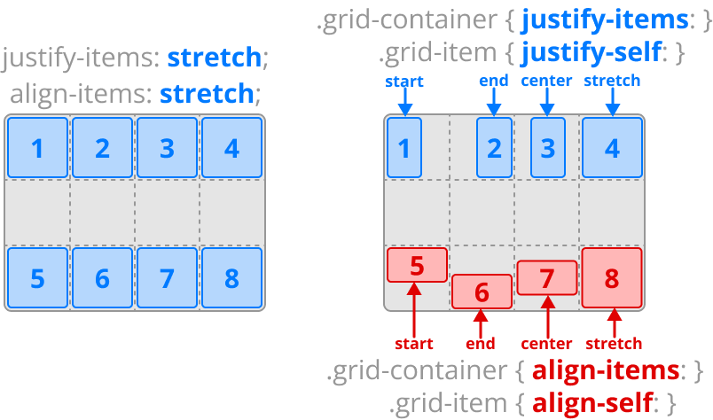
Below is an example where you may inspect the HTML and CSS.
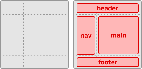
FlexBox and Grid work very well together. Flexbox is best used to arrange elements which all have a similar size. Grid is best used to arrange elements which have different sizes, for example, the overall page structure (header, side-bar, footer, …).
📝 Task 2: CSS Grid
- Create a Grid layout for Polly’s website
- start by setting
display: grid;on the<body>- create 3 rows and 2 columns
<header>should fill the 1st row<footer>should fill the 3rd row<nav>and<main>in the second row<nav>thinner than<main>- Give links in
<nav>a prettier style- Now that
<main>is thinner, you may have to adjust some flex properties- Keep the
<footer>always at the bottom
- set
min-height: 100vh;on the grid container (<body>)- this may be another css trick/idiom.
✅ TipThere are plenty more grid properties we didn’t cover. If you wish to learn more about Grid, check out: css-tricks.com: A Complete Guide to Grid
A responsive website is one which changes its layout depending on the size of the screen. The layout for a smart phone should be different than the layout for a desktop computer.
Responsive websites avoid fixed width values like 200px. Instead we would use proportional values like 50%. This way our elements can grow or shrink to fit any screen size. We also have vw and vh units, which are relative to the size of the viewport, where 1vw is 1% of the browsers width, and 1vh is `% of the browsers height.
If you have to use exact pixel values, try and use min-width, max-width, min-height, and max-height where possible. The properties will help your elements grow and shrink to fill the availble screen space.
One way to support different screen sizes is declare a different set of CSS rules for different screen sizes. We can easily do this with the CSS @media query.
- Copy the below CSS into the
style.cssof Polly’s website. - Resize the web browser (or zoom) to ensure it works as expected
/* X-Small screens (small phones) */
body {
    background-color: red;
}

/* Small screens (phones) */
@media (min-width: 320px) {
    body {
        background-color: orange;
    }
}

/* Medium screens (tablets) */
@media (min-width: 640px) {
    body {
        background-color: yellow;
    }
}

/* Large screens (laptops) */
@media (min-width: 1366px) {
    body {
        background-color: lime;
    }
}
📝 Task 3: Reponsive Layout
- Create 2 different Grid layouts for Polly’s site
- one for smart phone browsers
- one for desktop browsers
- the page should automatically change the layout when the browser window changes size
✅ TipIn the industry is is advised to prioritise the layout for mobile first. Largely because most people browse the web on their mobile phones.
This lab is worth marks. be sure to get signed off.