Lab 3: CSS Basics
🎯 Lab ObjectiveIn this lab, you will learn how to style web pages.
This lab teaches the following concepts:
- Page Styling with CSS
- CSS Box Model
- Document Flow
- Element Positioning
CSS is a declarative language used to make web pages look better. The colour, size, layout, position, …
Simple CSS syntax:
/* this is a CSS comment */
* {
    color: purple;
    background: orange;
}
The * means select all HTML elements, the rules enclosed in { swirly braces } describe themselves.
The easiest way to include CSS is to embed directly in the HTML file using a <style> element in the <head>. Something like this:
<html>
    <head>
        <style>
            * {
                color: purple;
                background: orange;
            }
        </style>
    </head>
    <body>
    </body>
</html>
📝 Task 1: Embedded CSS
- Use the HTML files from the previous lab.
- Create a copy
- Or modify the originals
- Create a
<style>element in the<head>element ofindex.html- Copy the CSS below into the
<style>element.* { color: purple; background: orange; }
- Test to make sure it matches the example below
📝 Task 2: Debugging CSS
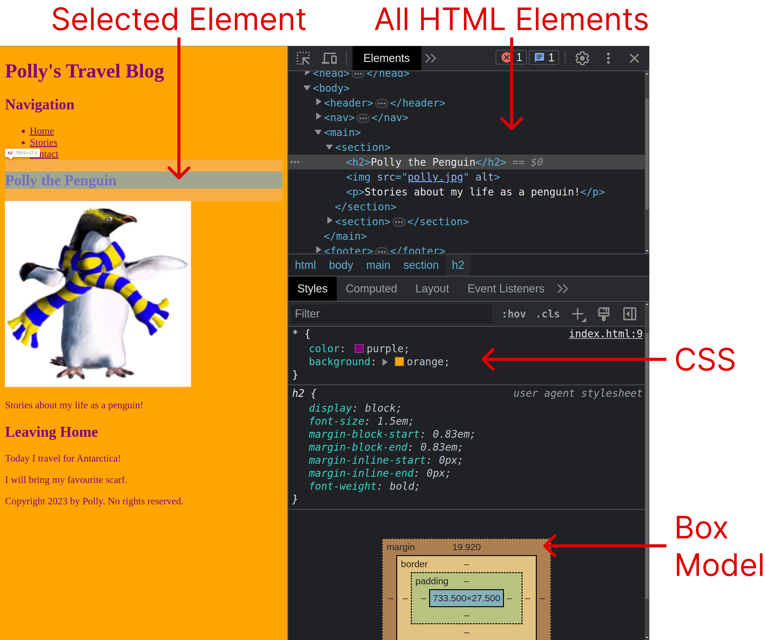
- From your Web Browser (Safari, Chrome, Firefox, etc…)
- Right click the page and click “Inspect”
- On Safari you must first enable dev tools
- Safari > Preferences > Advanced > Enable dev tools
- You should have opened the “dev tools” window
- Find the “Elements” tab (or “Inspector” in Firefox)
- You can hover over any HTML Element and inspect their styles.
It can be convenient to embedd CSS in the same file as your HTML. However, with several .html files it’s better to have a separate .css files they can all share.
✅ TipDuplicate Code is very bad practice for many reasons. Not least, because maintaining mutiple copies is more effort than it’s worth.
External CSS is more popular than embedding. The CSS is contained in a .css file, and the file is included in each .html file with a <link> element (usually in the <head>).
The <link> uses an href= attribute, just like the hyperlink <a> element. Though the href serves different purposes for each.
| Element | Tag | Location | Purpose |
|---|---|---|---|
| Anchor | <a>...</a> | <body> | When clicked, open a different webpage |
| Link | <link> | <head> | Include a resource in the current page |
📝 Task 3: Link External CSS
- Remove any embedded CSS
- Create a file called
style.css- Put your CSS in that file
- Insert a
<link>into each of your 3.htmlfiles
- set the
relattribute to"stylesheet"- set the
hrefattribute to"./style.css"
The <link> can include CSS, but it can also include other resources like, fonts, icons, and JavaScript files. These resource files can be local, or they could be could be absolute URLs linking anywhere on the web!
The next task shows how to link a font using an absolute URL from google’s free font collection.
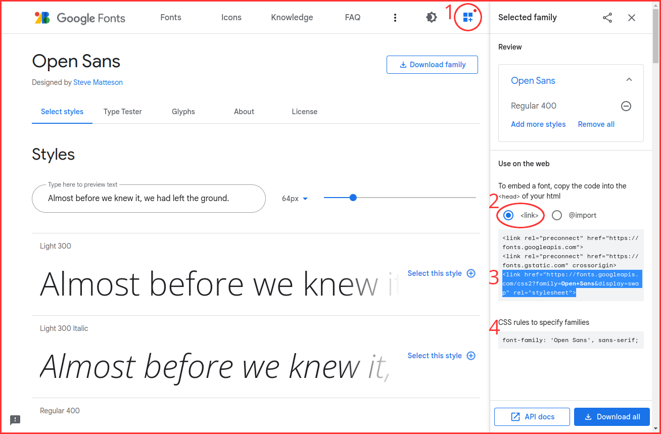
📝 Task 4: Custom FontChoose a any font here: https://fonts.google.com/
After you’ve decided on your font, add it to
style.cssusing the following steps:
- Open Selected family panel
- Select the
<link>option- Copy the entire
<link>code
- paste into the
<head>of your HTML files.- Copy the CSS rule(s)
- paste into
style.css- under the
background: orange;rule.
CSS syntax is simple, only 4 main aspects.
- Selector
- Rule
- Property
- Value
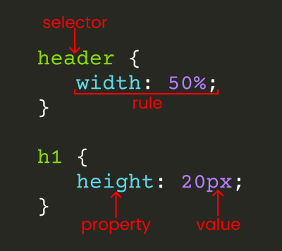
A CSS Selector identifies which HTML element(s) our style rules will apply to. Previously we used the Universial Selector (*) which selects all HTML elements.
A CSS Rule declares the style we want to apply. A Rule has two parts, the Property and the Value, e.g. color: red;.
CSS can select elements by tag name. For example, we could use h1 { rules } to style only the <h1> elements.
/* style the h1 element(s) red and large. */
h1 {
    color: red;
    font-size: large;
}

/* hide the footer */
footer {
    visibility: hidden;
}
📝 Task 5: Add some colour with the Element Type Selector
- Remove the
colorandbackgroundrules from the universial selector*instyle.css- Add these 4 selectors into
style.css
h1 { }h2 { }p { }a { }- Add the
colorproperty to those 4 selectors
- set them all to different colour values.
- Add the 5 selectors into
style.css
body { }header { }nav { }main { }footer { }- Add the
backgroundproperty to those 5 selectors
- set them all to different colour values.
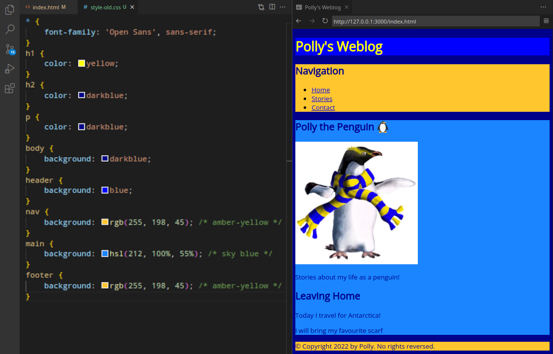
✅ TipCSS supports several colour formats: the easiest to use are named colours like
purple, but if you need a precise colour you should use HEX RGB, or HSL, which you may have seen in programs like PhotoShop.p { color: green; /* named colour */ color: #1100FF; /* hex color code */ color: rgb(255, 0, 127); /* RGB = Red, Green, Blue */ color: hsl(360, 82%, 56%); /* HSL = Hue, Saturation, Lightness */ /* colours with transparency (opacity / alpha) */ color: #1100FF22; color: rgba(255, 0, 127, 0.5); color: hsl(360, 82%, 56%, 0.5); }When choosing a colour palette for a website, definitely use tools like this one https://coolors.co/generate
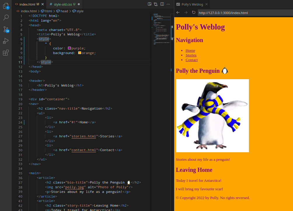
Your site should look something like this, but probably with different colours.
Class selectors allow us to be even more precise. By giving certain elements a class attribute (<h2 class="value"> ... </h2>) we can style only those elements.
The Class Attribute is assigned in the HTML, like any other attribute.
<p class="my-class-name">
    center these words!
</p>
The example below uses 3 different classes. Some of the elements have more than 1 class.
Finally, the highest level of specificity is the id selector. Similar to class except id must be a unique. The value of id cannot be on more than 1 element, and each element can only have one id at most.
Just like the class attribute, the id attribute may be any value.
<p id="custom-id-123">
    unique id here!
</p>
We have covered 4 different selectors: universal, type, class, and id. These 4 also correspond to levels of specifciity, with the universal being the least specific, and the id being the most.
| Selector | Syntax | Example | Specificity Level |
|---|---|---|---|
| Universal Selector | asterix | * | 1 (lowest specificity) |
| Type Selector | element | main | 10 |
| Class Selector | class | .myClass | 100 |
| id Selector | id | #myID | 1000 (highest specificity) |
A CSS rule at a higher level of specificity will override a rule at a lower level.
h1 {
    color: green;
}

* {
    color: red;
}
In the above example, any h1 element(s) will be green, because the type selector (h1) has a higher level of specificty than the universal selector (*).
📝 Task 6: Fonts Style with the Class Selector
- In
index.htmlthere should be 3<h2>elements.
- Give each
<h2>a different class value- Add 3 selectors for each class in
style.css- Style each
<h2>element differently
- The table below has some font properties to get you started
Property Example values color green, #00FF00, rgba(0, 255, 0, 0.5) font-size 12pt, 30px, 2em font-weight lighter, normal, bold, bolder, 900 font-family “serif”, “sans-serif”, “monospace” font-style normal, italic
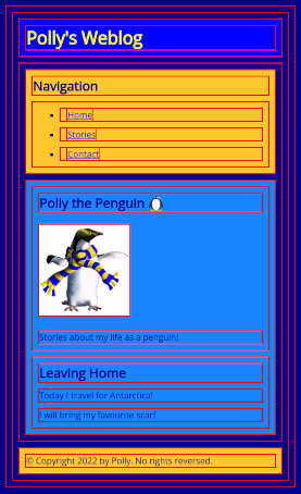
HTML elements render as rectangles. If we give each element a border, we can see these rectangles clearly.
Declare a border on every element like this:
* {
    border: 2px solid red;
    margin: 10px;
}
Each rectangle’s size can be changed with the width and height properties. Each element also has margin, border and padding properties which influences the size too.
margin
border
padding
- Margin: space between elements. Always transparent.
- Border: a border that surrounds the padding and content.
- Padding: space around the content. Always transparent.
These 3 properties determine the spacing between all block elements on a web page.
You can set the margin on all 4 sides with margin: 10px; (to 10 pixels wide).
Or you can set each side separately with margin-top, margin-right, margin-bottom, and margin-left. The same is true with padding: 10px; along with each side padding-top, padding-right, padding-bottom and padding-left.
Measurements in CSS require units.
pxan absolute measure of in pixels.- Where
width: 100px;is exactly 100 pixels wide.
- Where
%is relative to the parent element.- Where
width: 50%;is half the width of the parent.
- Where
emis relative to the font size.- Where
width: 2emis twice the width of the current font.
- Where
Since the border is not transparent (unlike margin and padding) it has some visual properties, including: border-color and border-radius.
* {
    border-width: 1px;
    border-style: solid;
    border-color: red;

    border: 1px solid red; /* all at once */

    border-radius: 10px; /* rounded corners */
}
📝 Task 7: Circular Image
- In your CSS any kind of selector for your
<img>element.
- either class, id, or even a type selector
- Add
margin: 20px;- Add a a border.
- Add properties for
widthandheight
- can you stretch the image horizontally?
- Use the following property to “crop” instead of stretch
object-fit: cover;- Use the following property to move the crop location
object-position: 0% 0%;- the first value is horizontal, the second is vertcal
- what values will crop the top half of Polly?
- To make the image a circle
- Revert it back to a square
- Add the property
border-radius
- can you give the image rounded corners?
- can you round the corners so large, it becomes a circle?
You’ll have plenty of opportunities to play with CSS in Assignment 1
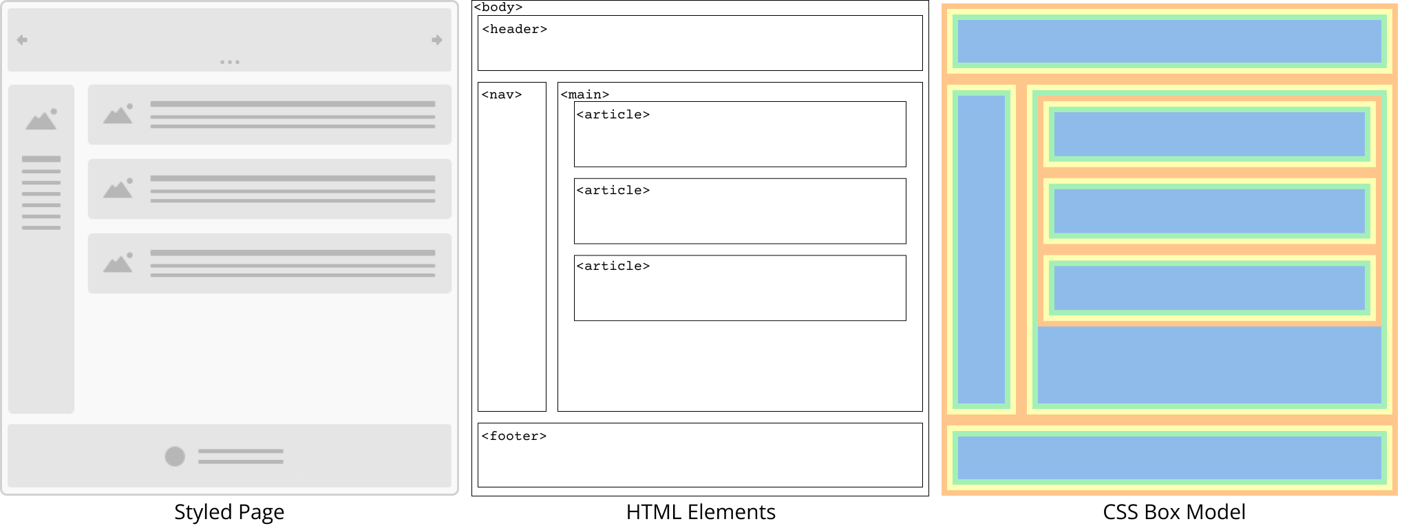
Web document styling is inspired by physical, paper document typesetting (like magazines or newspapers). Document flow the default layout without any CSS.
Document flow was designed for text and images. Where block elements display in a vertical direction, stacking from top to bottom. Inline elements display in a horizontal direction, stacking from left to right.
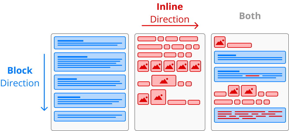
Inline elements are most useful when inside a block element. In the example below an inline anchor element (<a>) is inside a block paragraph element (<p>).
Two very important elements for page layout are <div> and <span>. They are known as organisational elements, as they are usually used for grouping and organising other elements. The <div> element is a block element, and <span> is inline.
The semantic HTML elements: <header>, <footer>, <main>, <nav>, <section>,<article>, … are all basically <div> elements, as they are all display: block; by default. The only difference are the semantic names that help SEO and accessibility browsers. If you cannot think of a semantic HTML element for your content, just use a <div>. Similarly: <a>, <img>, and <button> are essentially <span> elements, as they are display: inline; by default.
You can always change the default display mode of any element using the display property.
header {
    display: inline;
}
img {
    display: block;
}
✅ TipThere is also:display: nonewhich removes the element completely.
📝 Task 8: Play with Images
- Centre the image of Polly
- First you need to set the image’s
displayproperty toblock- You can centre block elements horizontally with
margin: auto- So, set
margin-leftandmargin-righttoauto- Box shadows
- Shadows on block elements are easy with the
box-shadowproperty- For example
box-shadow: 0 8px 16px 4px red;
0horizontal offset8pxvertical offset16pxblur amount4pxspread (optional)redshadow’s colour- Give the photo of Polly a visually pleasing shadow
- Text Shadows
- Use the
text-shadowproperty on your web page somewhere
Both block and inline have limitations:
- Block elements don’t naturally sit side-by-side
- Inline elements ignore many Box Model properties
- i.e. you cannot set:
width,height,top-margin,top-padding,bottom-margin, orbottom-padding.
- i.e. you cannot set:
To give us the best of block and inline together we have display: inline-block;. Which allows elements to be easily placed side-by-side and it allows any Box Model property to be set.
✅ TipThe inline display mode was designed for text, this is why certain Box Model properties are ignored as they make little sense for text. Instead, to change the height of inline elements use the
line-heightproperty (Behaves like double spaced text). And to adjust the vertical spacing use thevertical-alignproperty.Left and right margins still behave as expected on inline elements.
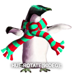
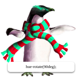
📝 Task 9: Image FiltersLet’s create a grid of image figures (as pictured below)
- Somwhere in
index.htmlcreate a bunch of<figure>elements
- at least 8, maybe around 12?
- each
<figure>should have 2 nested children
- an
<img>element- a
<figcaption>element- Something like the following:
<figure>
    <img src="polly.jpg" alt="Photo of Polly">
    <figcaption>caption</figcaption>
</figure>
<figure>
    <img src="polly.jpg" alt="Photo of Polly">
    <figcaption>caption</figcaption>
</figure>
- Make each
<figure>display as an inline-block
- adjust the CSS so the images appear in a neat grid
- hints:
<figure>has some default margin- Use a filter an each image
- give each
<img>an identifier (id) attribute- using the
idgive each image a differentfilterproperty
- For example, one could be:
filter: blur(5px)- Some could have two (or more) filters:
filter: brightness(100%) contrast(150%);- More filter examples provided below
- Don’t forget to give each figure a useful caption
We can alter the position of an element within the document flow if we change the position property. The default is position: static and cannot be moved. However, position relative, fixed, and absolute can be moved.
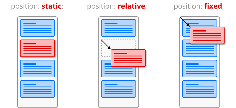
position: static elements cannot be moved in the document flow.
position: relative elements can be moved. Their movement is relative to their original position in the document flow.
position: fixed elements are removed from the document flow. Their position is relative to the viewport. Scrolling has no effect on fixed position elements.
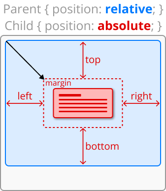
Movement is controlled with the properties: top, right, bottom, left. They directly control the distance between the element’s margin and its parent’s padding. You can change all 4 sides at once useing the shorthand inset property.
div {
    position: relative; /* enable positioning */

    top: 0;
    right: 20%;
    bottom: 0;
    left: 20%;

    inset: 10px; /* all 4 sides */
    inset: 0 20% 0 20%; /* top right bottom left */
}
Lastly, position: absolute; elements are removed from the document flow, just like fixed. However, their movement is relative to their first non-static parent.
A common design pattern is to position a parent container relative which has a child element positioned absolute. In this fashion, the parent container remains in the document flow, and the child is easily placed anywhere within the bounds of the parent.
📝 Task 10: Position Text
- Position the
<h1>somewhere within the<header>
- use the design pattern: parent relative, child absolute.
- the pattern is provided below
- values for
positionare provided- some suggested values are also included
- but you may use any properties you think might help
header {
    position: relative;
    height: ?;
}
h1 {
    position: absolute;
    left: ?;
    top: ?;
}
- Centre the text in the
<footer>
- the below miethod is far simpler than above
- but it only works for tex and is far less flexible
footer {
    text-align: center;
    padding: ?;
}
- Position the captions (
<figurecaption>) elements in front of the images.
- two examples are given below
- style the font nicely
- hints:
- use the design pattern mentioned above
- which element is the parent?
- which element is the child?
- how do you move a positioned element?
✅ Tip(This tip isn’t needed for the current lab.)
Positioned elements can overlap eachother. Changing the
z-indexproperty will control which elements are in front or behind.div { z-index: 100; }Elements with a higher z-index are rendered in front of elements with lower z-index.
Negative z-index values are allowed.
This lab is worth marks. be sure to get signed off.